World of Level Design™
Tutorials to Becoming the Best Level Designer and Game Environment Artist (since 2008)

UDK Pirate Challenge Winners and Runner Ups have been chosen. The top winner and the runner ups were chosen by Epic Games®. The top 5 list includes designer notes from Epic Games.
1st: PhantomFragger
2nd: DeltaThunder
3rd/4th: Demonizer and Inksworth (tied)
5th: BasketQase
WINNER:
PhantomFragger
Designer Notes from Epic Games:
- Nice variety of building shapes and types and like the layout of the interior space (again, lighting is unfortunately not fleshed out enough and too dark though). I do wish there was more variety in tone on the buildings however, too much white brick all over. This would have benefitted from fleshing out the surrounding areas a bit more to allow for the camera to be pulled out and show a bigger scope/picture.
- I like this because it looks like a believable place, and again, like somewhere I'd want to explore.


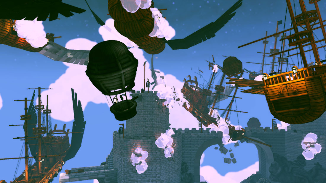
RUNNER UPS:
Deltathunder
Designer Notes from Epic Games:
- Love the dynamic setup of the scene and stylized sensibility, chains in motion, crashes, bridges collapsing and clouds etc all are nice touches. I feel like he made the most out of the set by embracing it's cartoony textures and translating them into a scene that could come from a game that was built with that style in mind. Lighting supports that nicely. Minor crit is that the fortresses could have been a little more fleshed out and have more interesting shapes and silhouettes going on.
- Imaginative idea with some great details, although the screenshots have come out a little noisy and overcrowded.
- I love the creative use of the rocks as clouds and smoke. There are some really insane looking airships and Balloons, I absolutely love what you did with the meshes!


Demonizer
Designer Notes from Epic Games:
- Kudos for having an entry that is completely unique among submissions and looks great and dynamic and shows good design sensibilities but I feel it was more the result of freestyling and not careful planning. I wish he had done something with a sail as well to maybe follow the idea of this thing being a gigantic shipwreck turned into a monster. It's a just little too abstract IMO and the scale of the individual objects in relation to each other doesn't make much sense. Now if that thing was actually rising out of the water and smashing a pier or other ship to bits..
- It's stretching the theme a little, but really nicely put together. Looks like a still from an awesome animation.
- I never would have imagined using the pieces like this, I especially love the shot of the God Smashing his hand down - fantastic work!


Inksworth
Designer Notes from Epic Games:
- Biggest plus for scope of the scenes and incoporating 3 typical pirate settings into this. The city shot is nice and the night time setup works well. Scale sensibilities have some issues here however (ship is way too chunky) and the interior could have used a more interesting layout (bigger scope with some fore/mid/background serparating elements like a tall center support structure, some archways looking into other rooms, some variation in height. Hint at how the space would function, and also hint at things you can't see in the scene, right now it's a giant box with stuff)


BasketQase
Designer Notes from Epic Games:
- Really like the layout of the space and variety of structures (the tower looks great) and interesting organic shapes. Scale sensibilities are nice and big bulky contrasts nicely with small fine details. If it weren't for the lighting of the scene this would have placed much higher on my list. The direction and idea is spot on (gloomy fortress tucked close to a cliff with sunlight cupping up from behind) but the execution isn't quite there. Even some minor tweaking with fill lights and/or bounce settings in Lightmass would have helped this a lot. Also throwing simple volumetric sheets in there to bring out some of the shapes more as well as adding brighter accent lighting hotspots (lanterns/fires) would have improved this quite a bit. Too dark :(


SUBSCRIBE & GET FREE UE5 PDF GUIDE
Subscribe to receive NEW/UPDATED and FREE "UE5 Beginner's Quick Start Guide" PDF (90 pages).

Visit this page for more info about the guide...
TOP 5 TUTORIAL COURSES FOR 2026
 Maya Foundation: Home-Study Course - Model and UV Environments
 Substance 3D Painter Essentials - Master Texturing
 UE5: Fundamentals Vol.1 - Create with Unreal Engine 5
 UE5: Retro Office Project - Create Beautiful Interior Env
 UE5: Master Material Creation - Create Master Materials in UE5
TUTORIAL CATEGORIES
UE5 FUNDAMENTALS VOL.1 COURSE
UE5: RETRO OFFICE PROJECT
MAYA FOUNDATION COURSE

SUBSTANCE PAINTER ESSENTIALS

LEARN THE PREPRODUCTION PROCESS
ABOUT WoLD & ALEXG

My name is AlexG. I am self-taught level designer, game environment artist and the creator of World of Level Design.com. I've learned everything I know from personal experimentation and decades of being around various online communities of fellow environment artist and level designers. On World of Level Design you will find tutorials to make you become the best level designer and game environment artist.
Home Terms of Use/Trademarks/Disclaimers Privacy Policy Donate About Contact
All content on this website is copyrighted ©2008-2024 World of Level Design LLC. All rights reserved.
Duplication and distribution is illegal and strictly prohibited.
World of Level Design LLC is an independent company. World of Level Design website, its tutorials and products are not endorsed, sponsored or approved by any mentioned companies on this website in any way. All content is based on my own personal experimentation, experience and opinion. World of Level Design™ and 11 Day Level Design™ are trademarks of AlexG.
Template powered by w3.css